GRASSROOTS 365 REBRAND
BRAND SYSTEM / EVENT PLATFORM
G365 exist as a year-round basketball platform. It’s designed to support a AAU athletes development through tournament and exposure opportunities.
My role: Design Direction, Branding, Social Media concepts, UI Design, Logo Design & Type Design
Objective: Create a scalable visual system that unifies a high volume of nationwide events, ensuring Grassroots 365 maintains a consistent and recognizable identity across all platforms.
Design Process
Typography
Color
Design Elements
Application
Social Graphics
Tournament Graphics
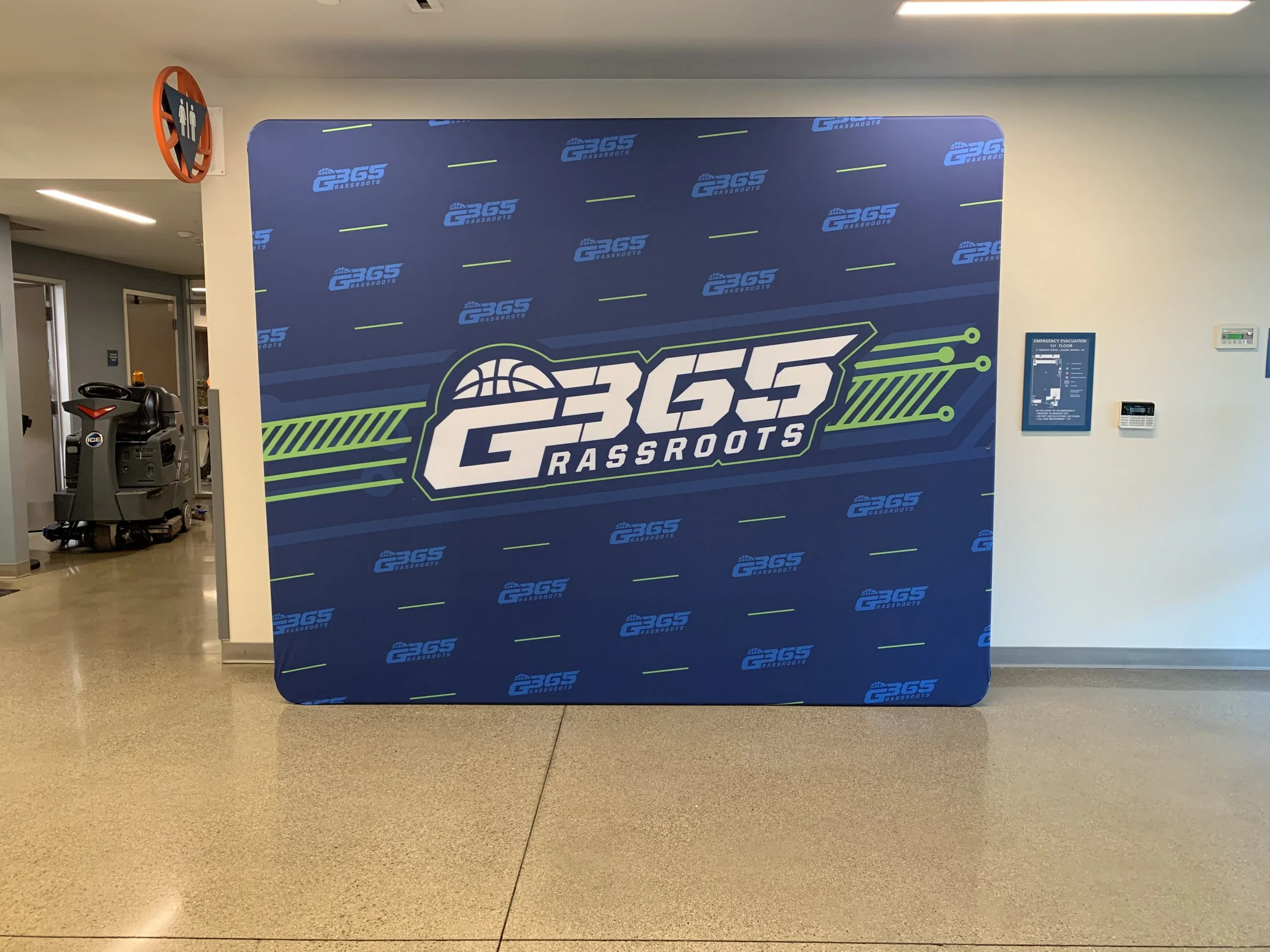
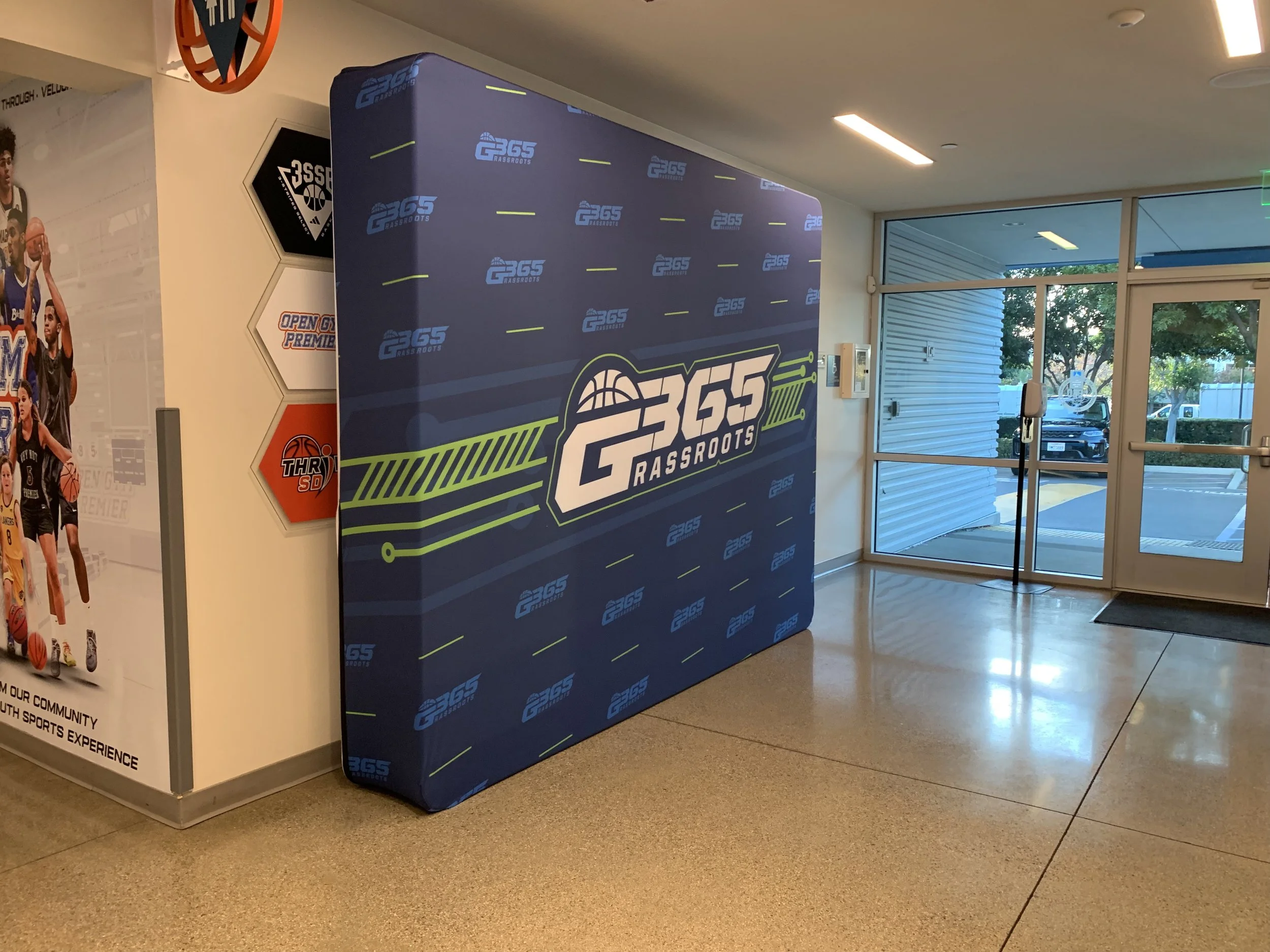
Branding Experience (Signage)
Website Design
Connecting Digital, Web and Print

Typography
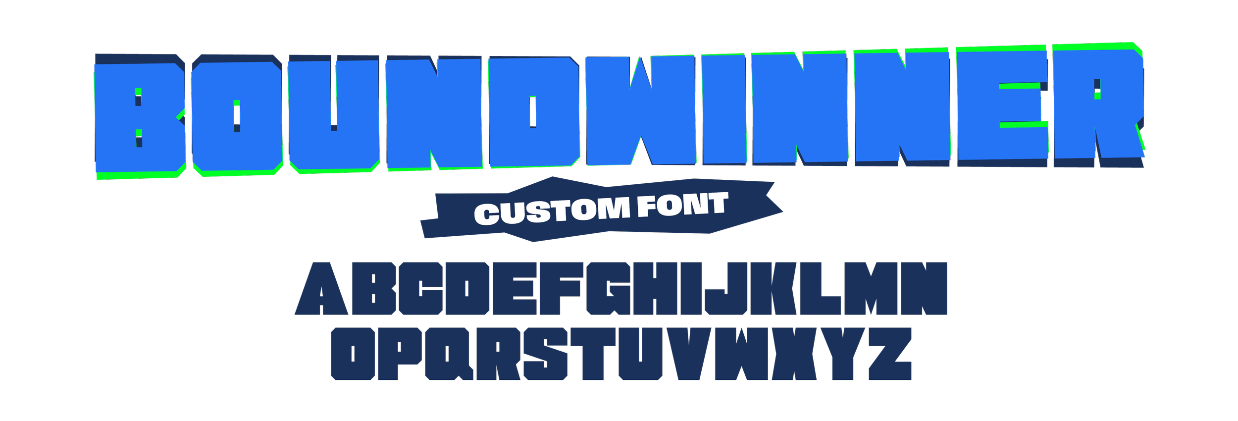
Boundwinner
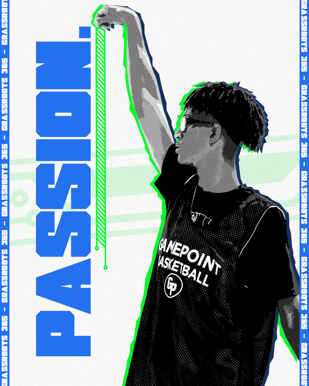
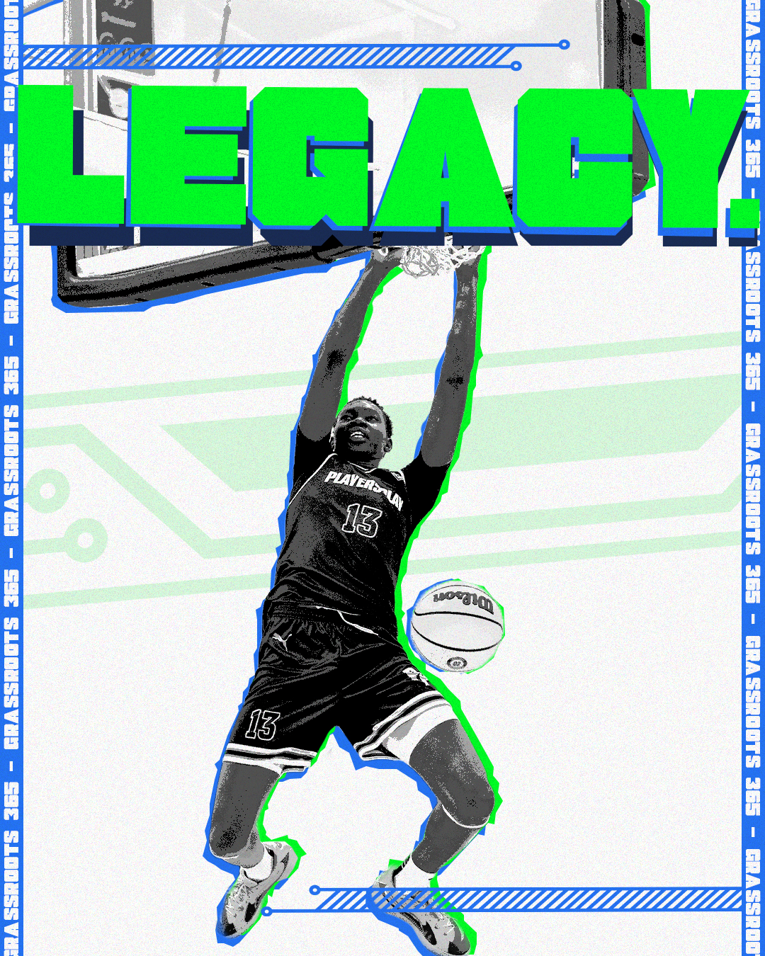
I decided to design a custom typeface used to be BOLD, energetic, and in your face.
Only used for short word concepts.
Can be used across all platforms, mainly to grab your attention. A few examples are..
Instagram video covers
Exterior Signage
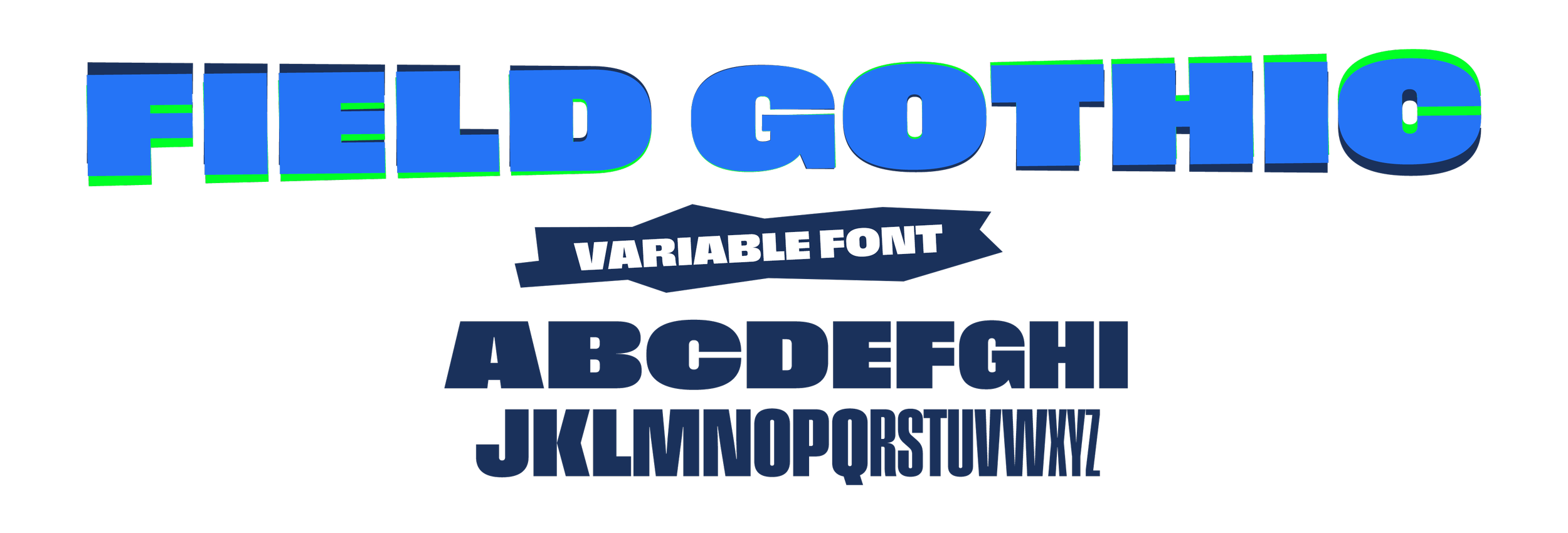
Field Gothic
A variable font that can be used for multiple applications.
From thin to bold, condensed to wide. This font has it all, however the main three that are used are…
Field Gothic Condensed (Headlines)
Field Gothic Wide (Sub-headlines)
Field Gothic Regular (Body copy)
Color
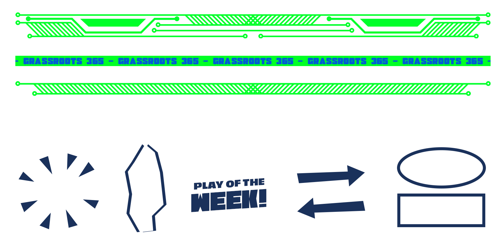
Design Elements


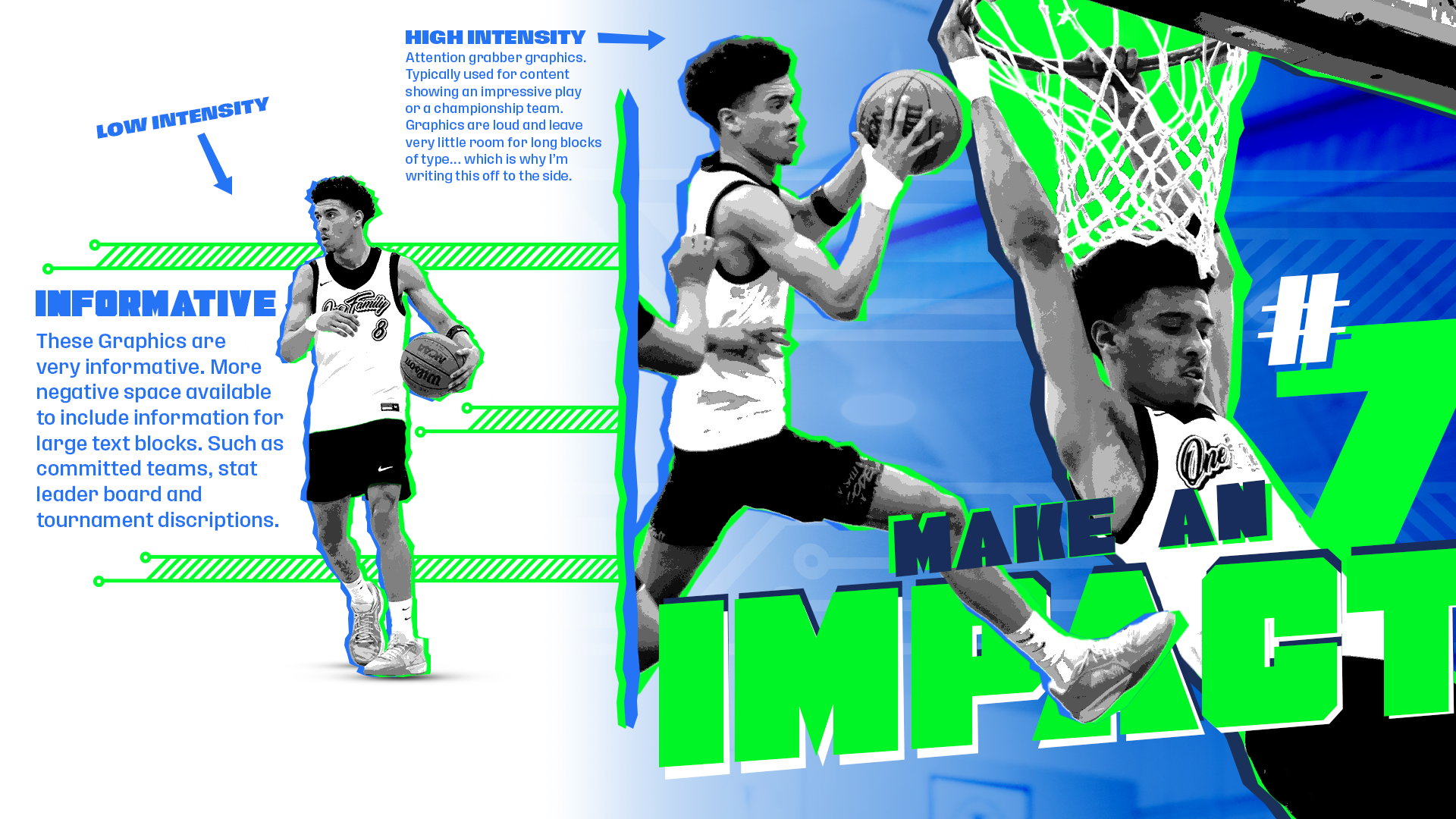
Low to High Intensity
Intention with each design.
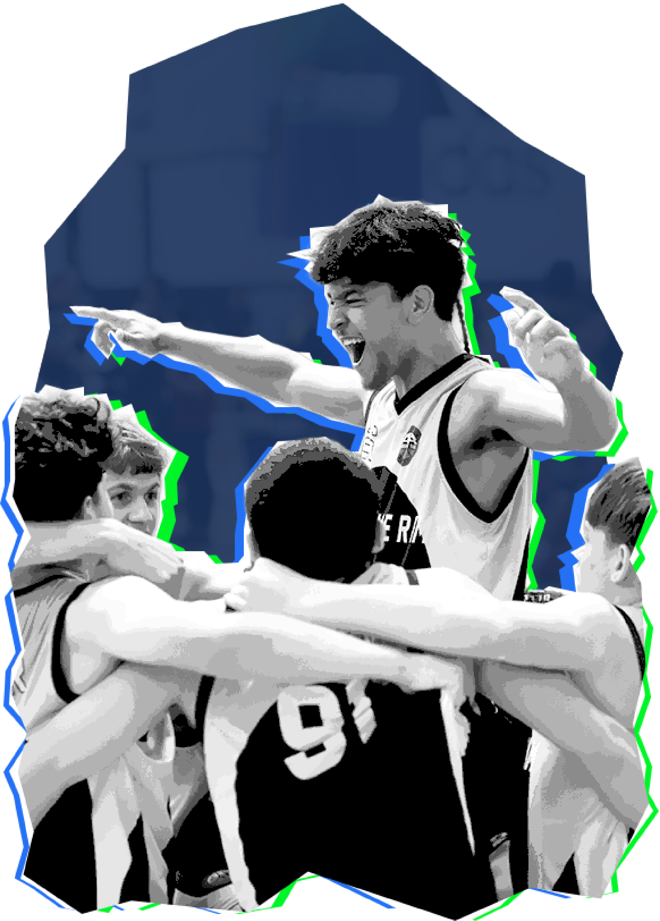
G365 is a Basketball tournament company that holds anywhere from 1-4 tournaments each weekend. With that in perspective, there is a lot of design content that needs to be posted before, during, and after…
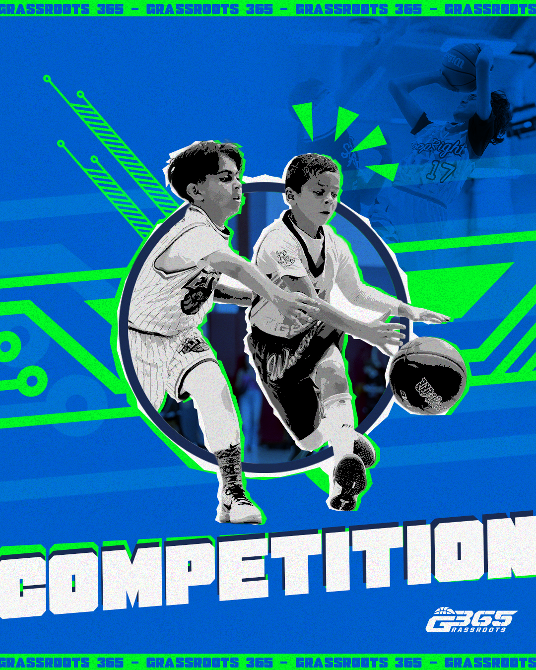
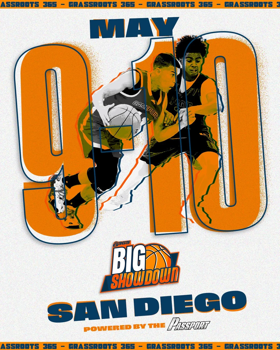
Tournament Announcement
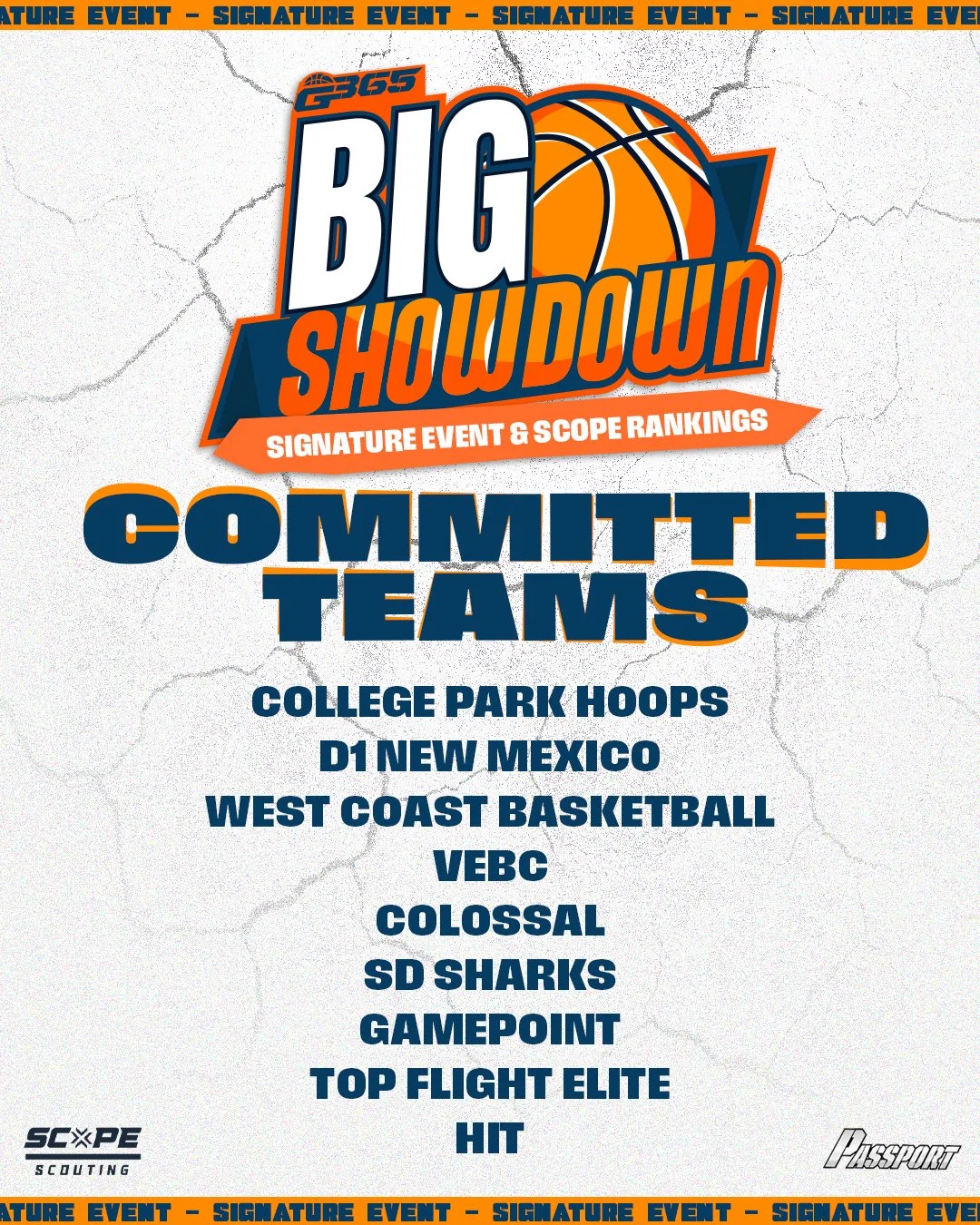
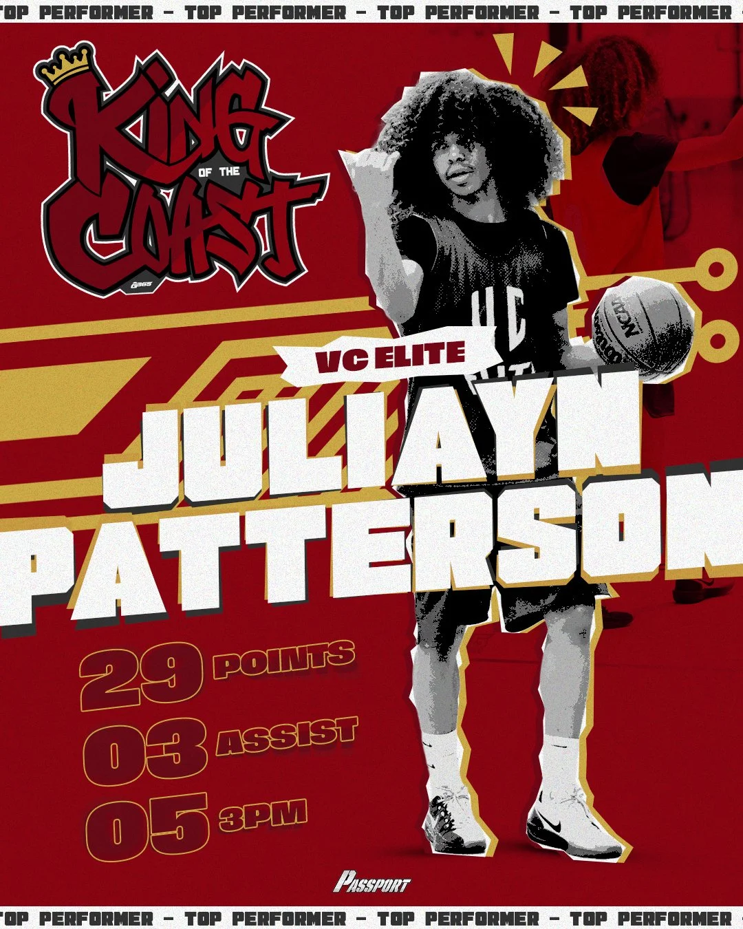
Committed Teams
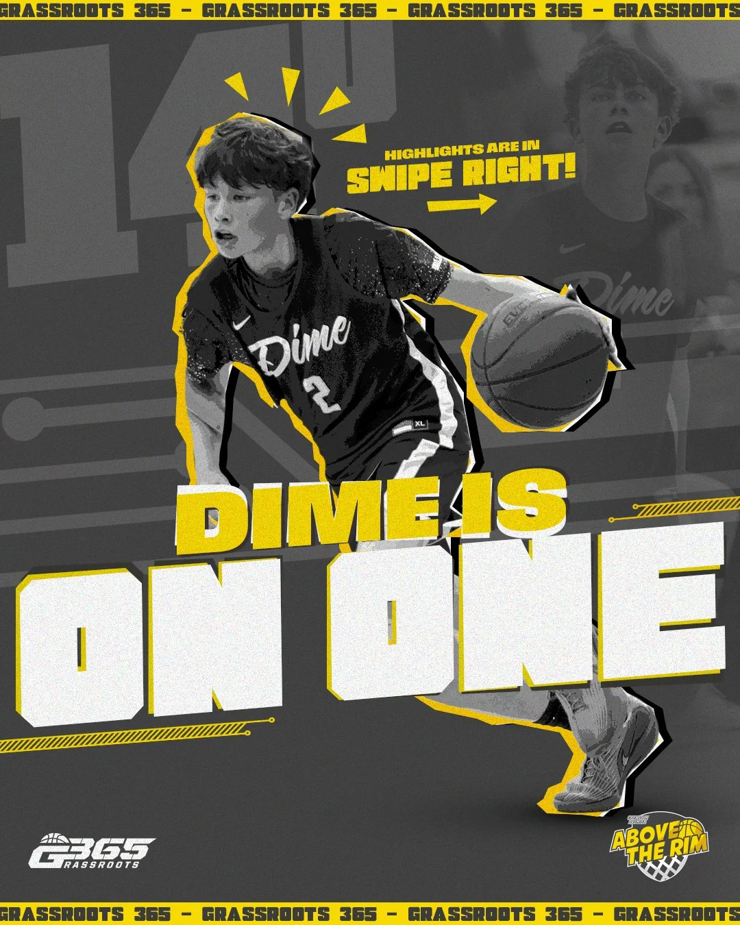
Players to Watch
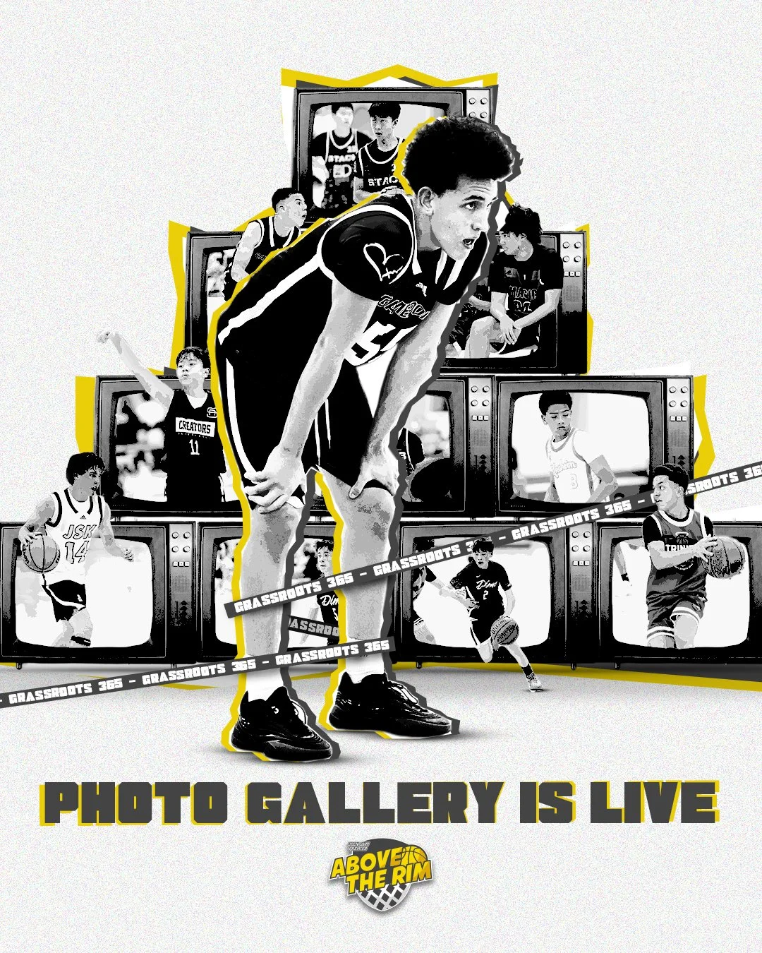
Video Covers
Stat Graphics
All Tournament Graphics
Low to High intensity puts purpose behind each design.
Low intensity Graphic, is one that includes a lot of typography which needs clear legibility.
High intensity thats BOLD and intense, that grabs your attention right away.
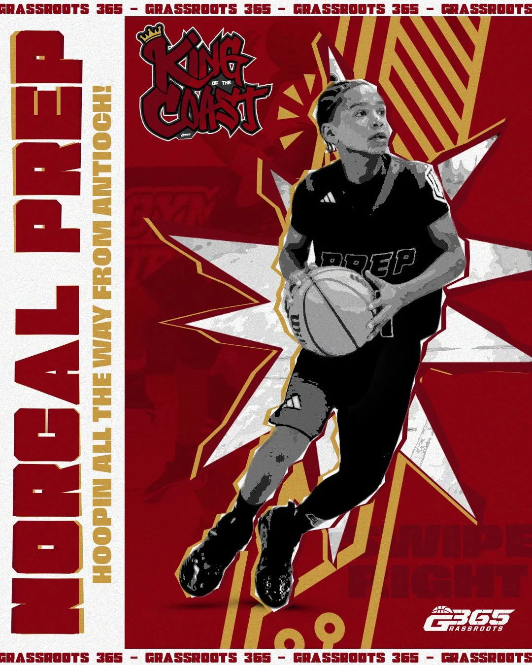
Tournament Graphics
One of the biggest pain points of this rebrand, was what to do with each tournaments overall look. In order to keep everything consistent, the overall look stays the same, however the color scheme will change to match that of the tournament logo.
Low to High intensity along with all the design elements stay the same.
Each tournament has an existing logo, the colors are then swapped to match that logo.
Really only affects social media… Web design and physical branding keep the same color scheme.

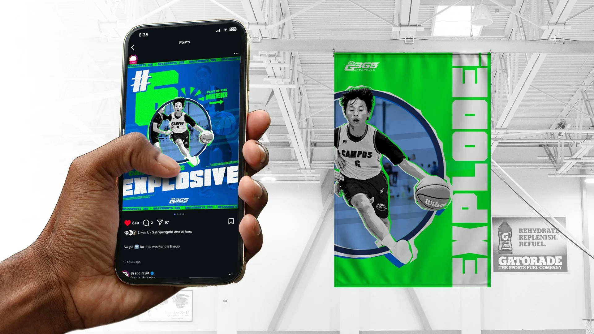
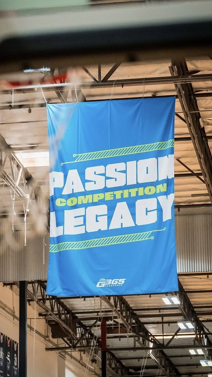
Connecting Digital & Print
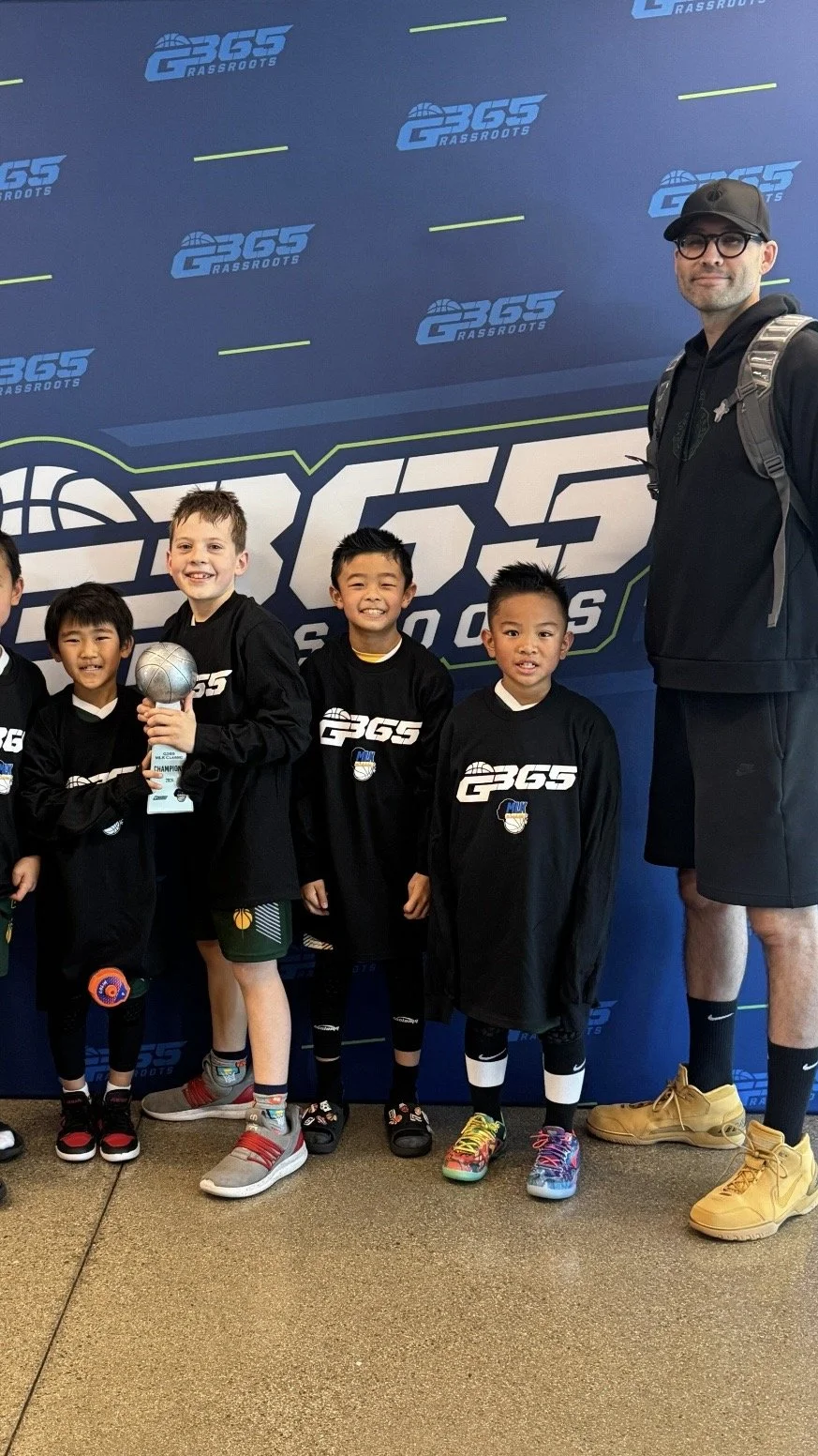
An issue with G365’s past design’s across all medias is they never reflected one another. In fact the physical branding had no identity at all. This was a huge emphasis that needed to be changed…
Consistency was key in this, making sure if you were looking at the tournament on instagram, it looks and feels like you were actually there in person.
Using similar elements across all platforms.
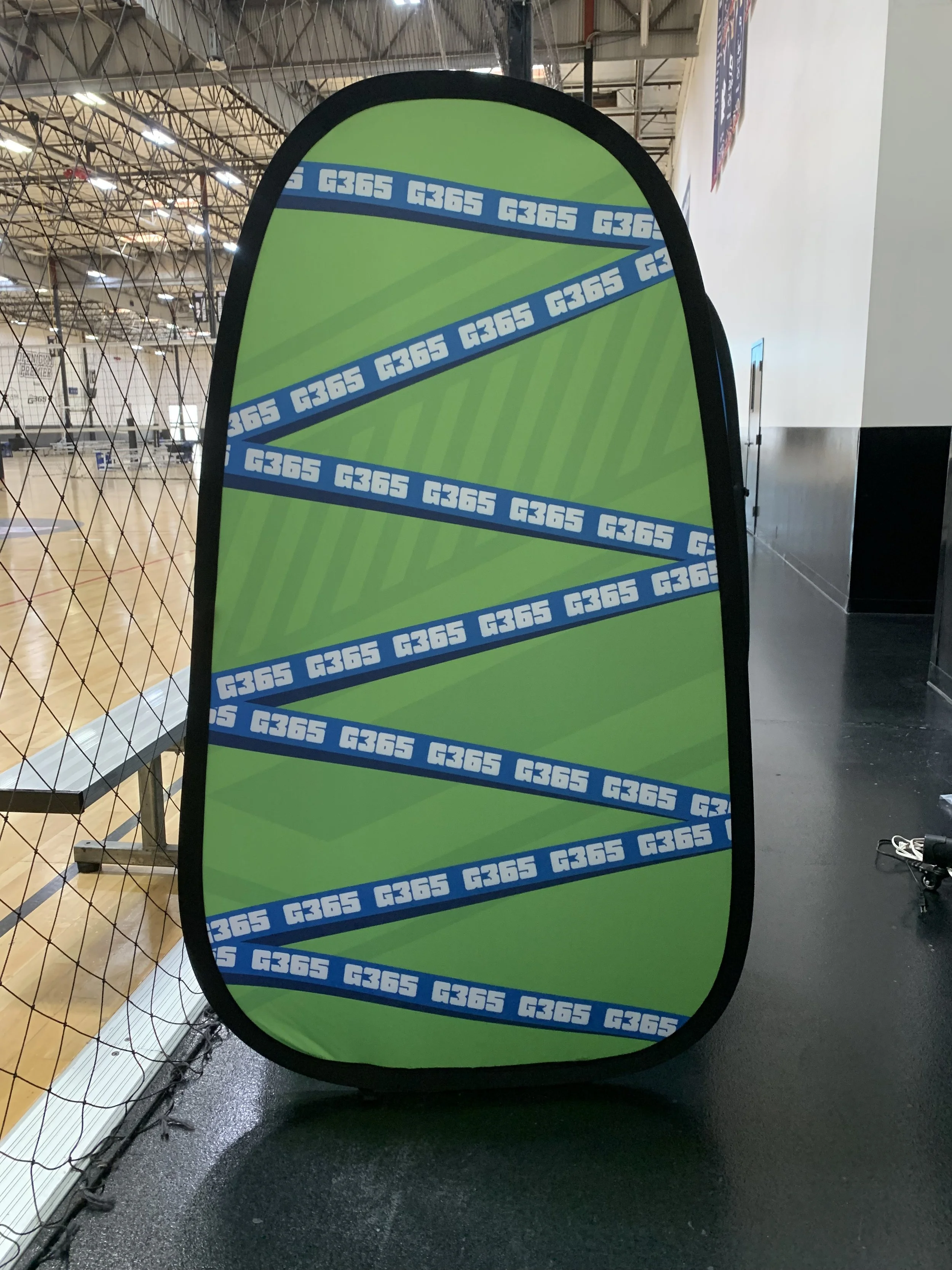
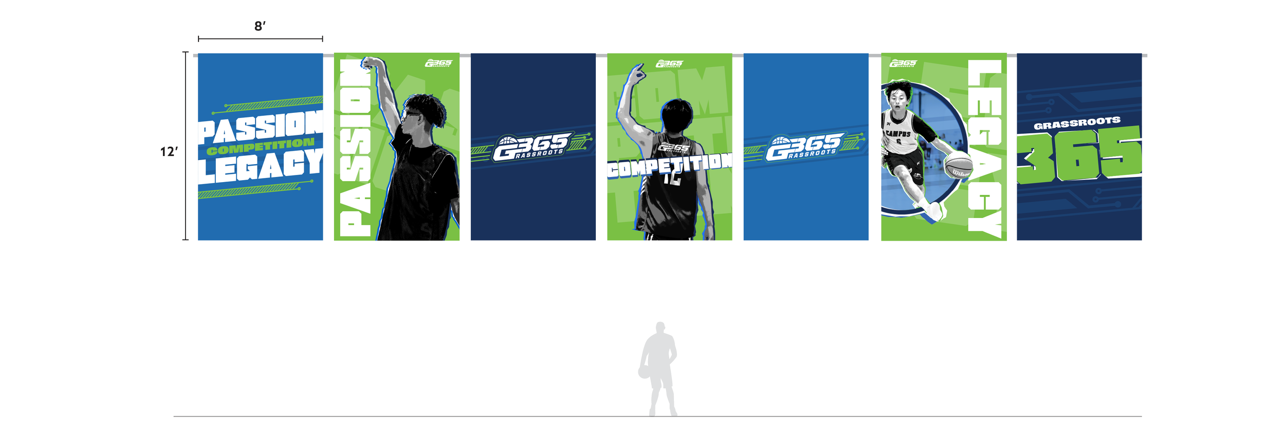
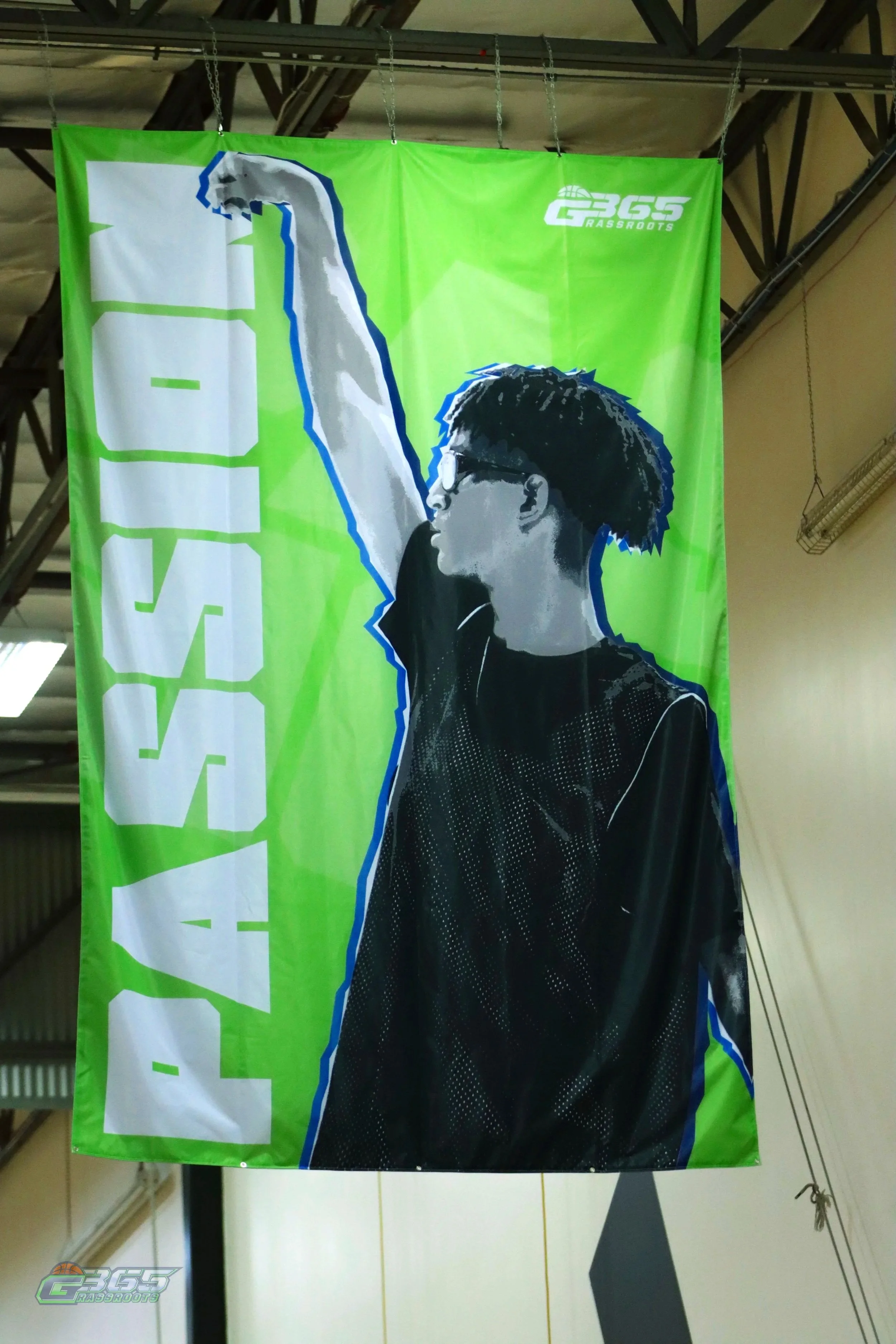
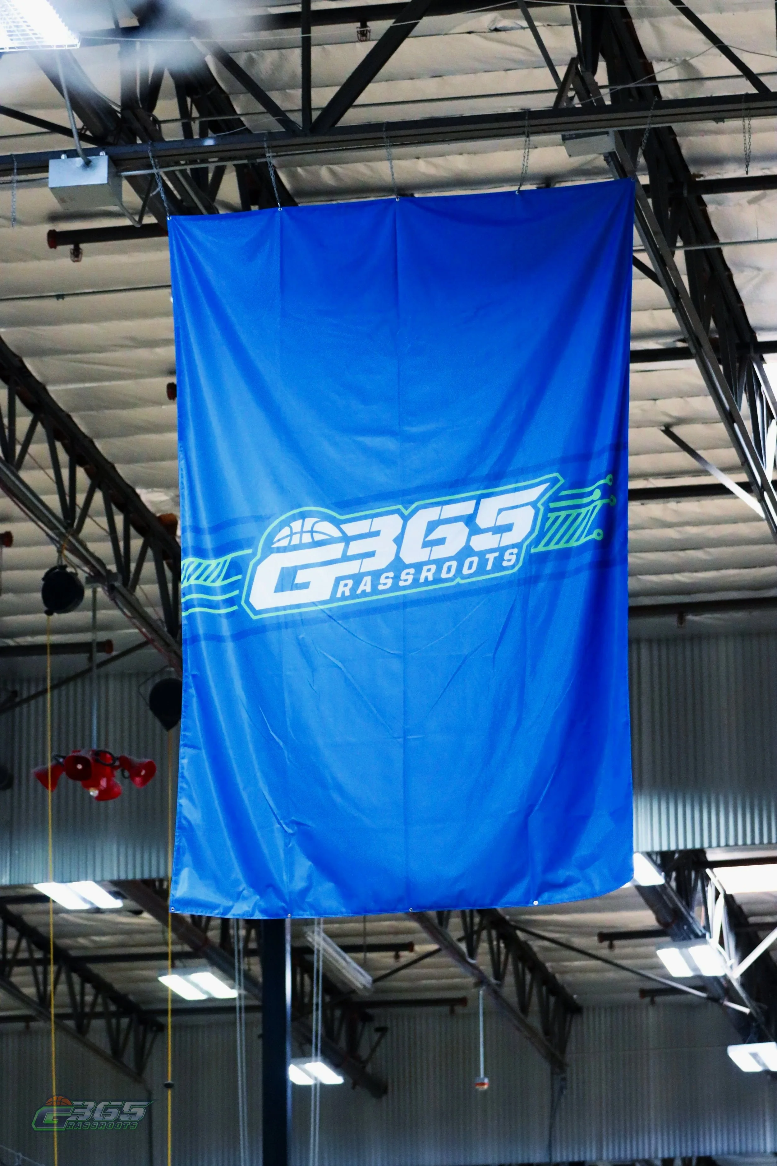
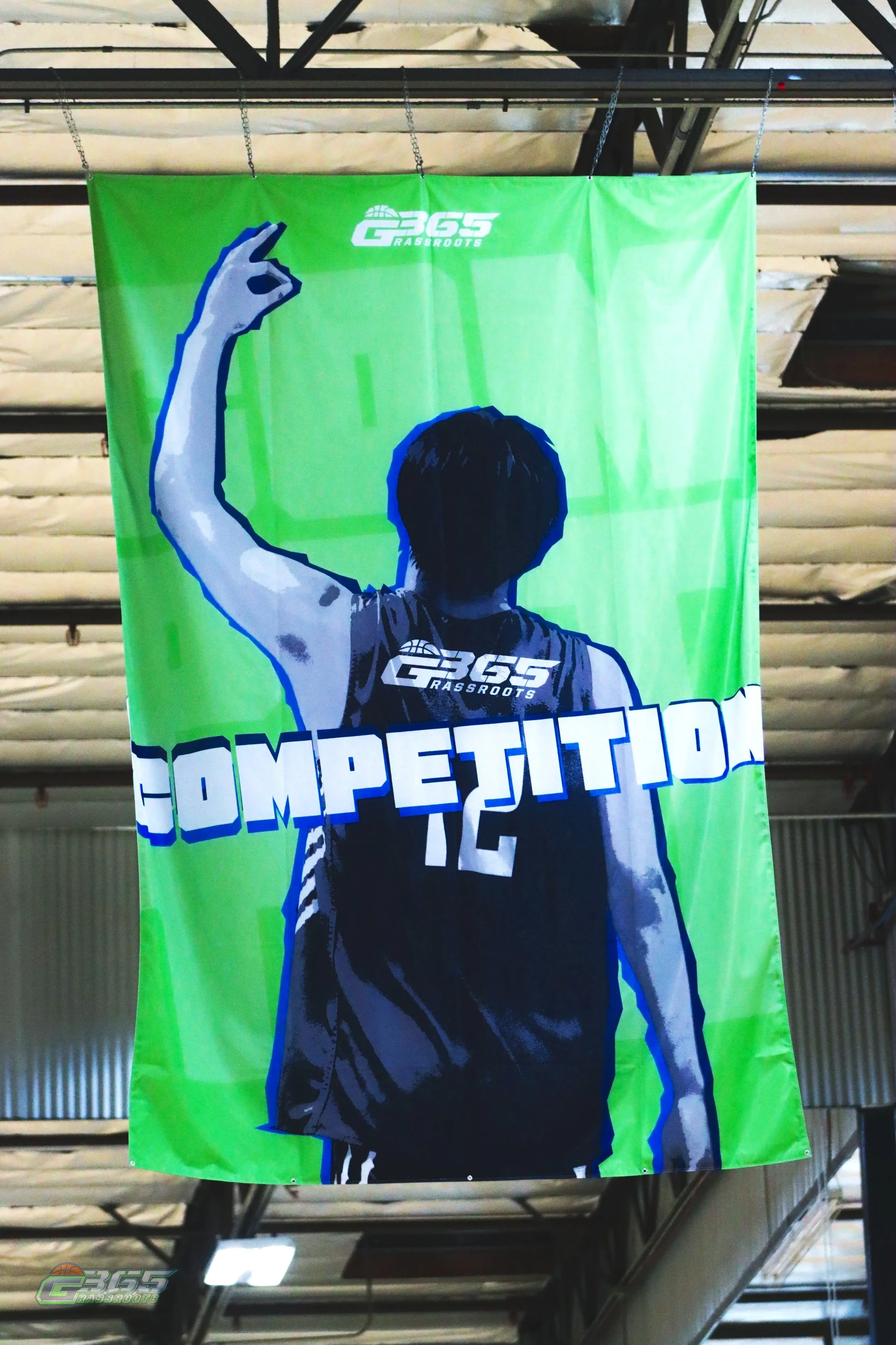
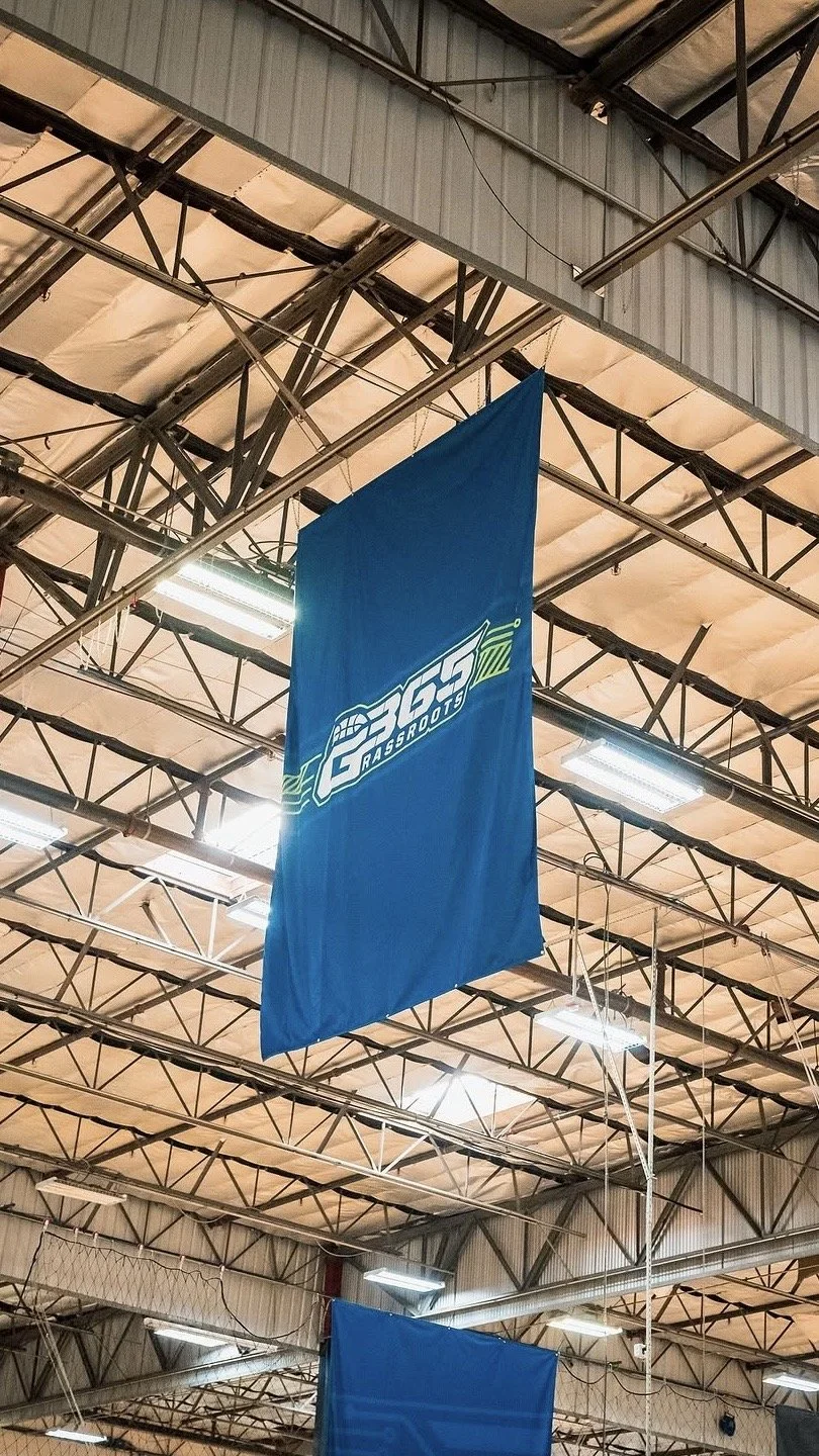
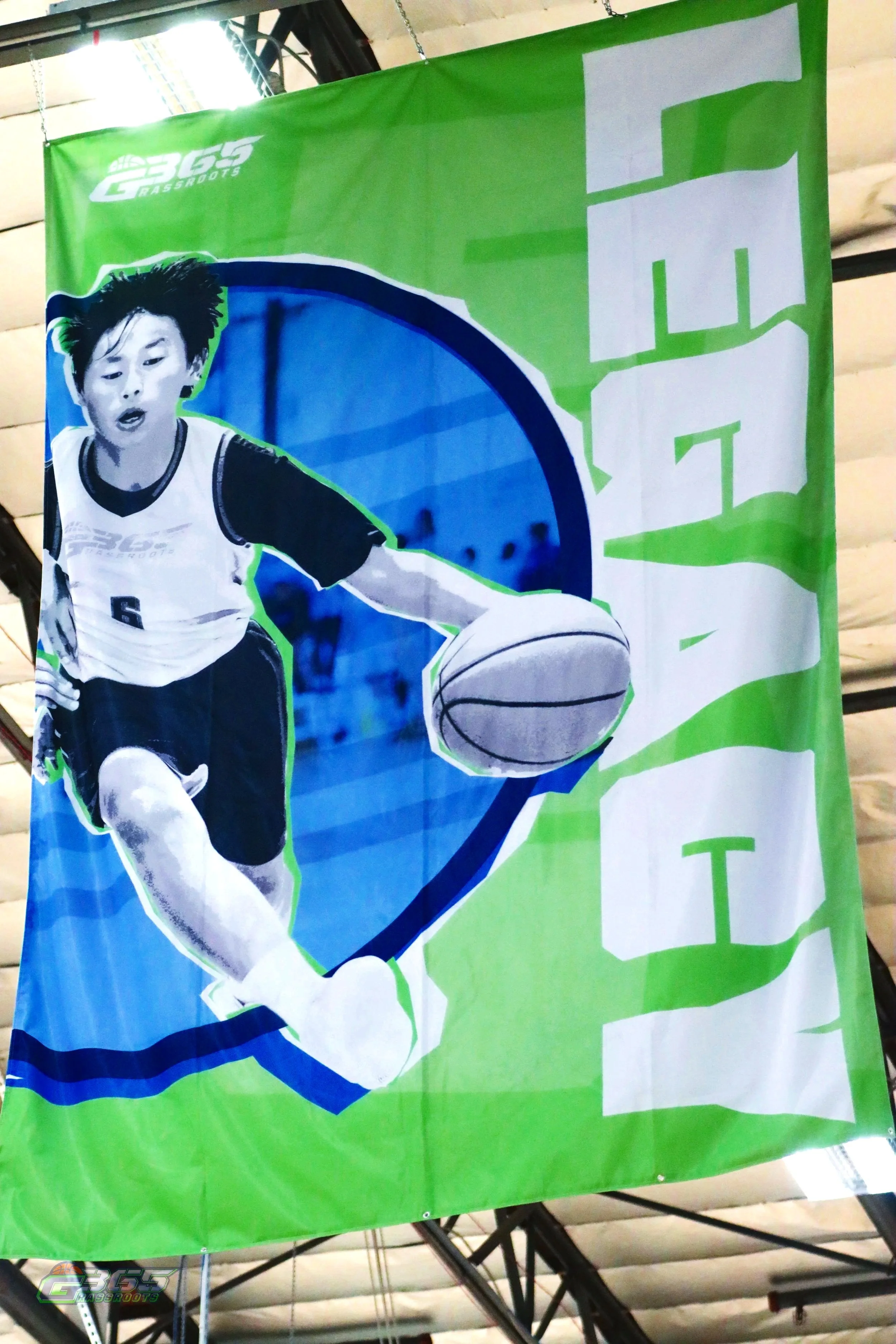
Hanging Banners
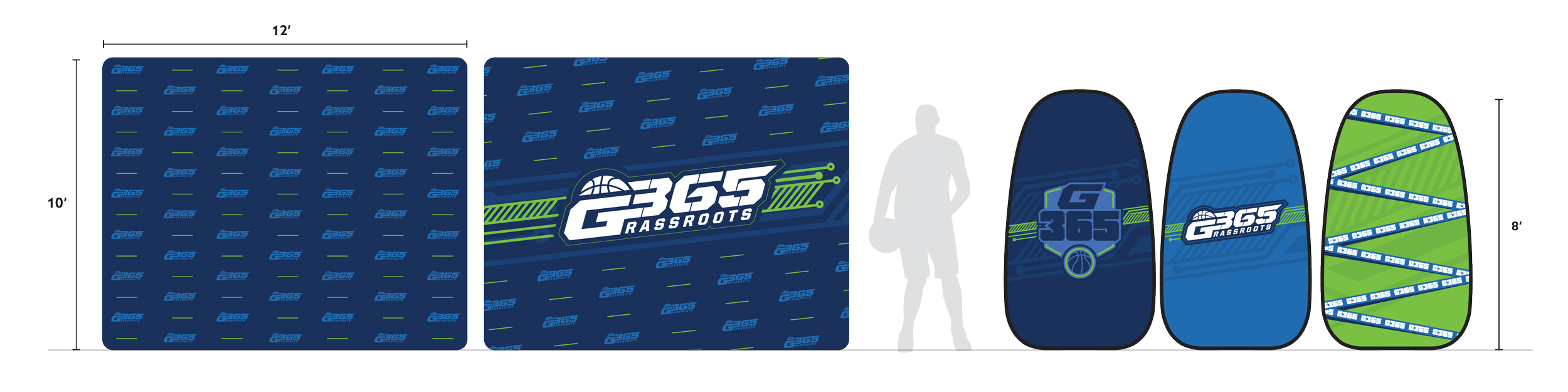
The first look when an athlete walks into a 9 basketball court facility, really sets the tone. These banners were designed to do just that
G365 uses multiple locations across California and the rest of the nation. Sometimes they hold 9 basketball courts, others just 3. Each of these design pieces are used and seen on every court.
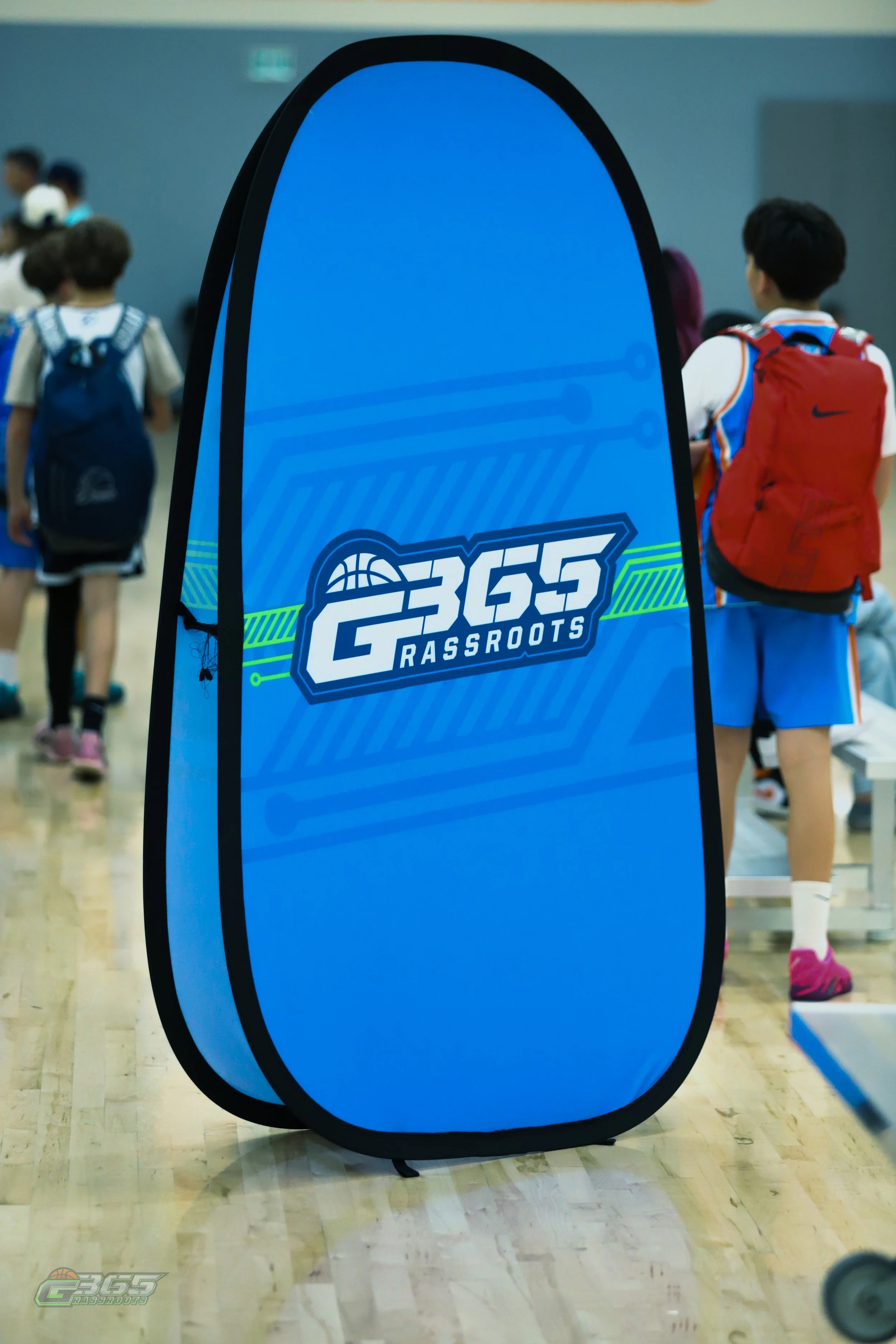
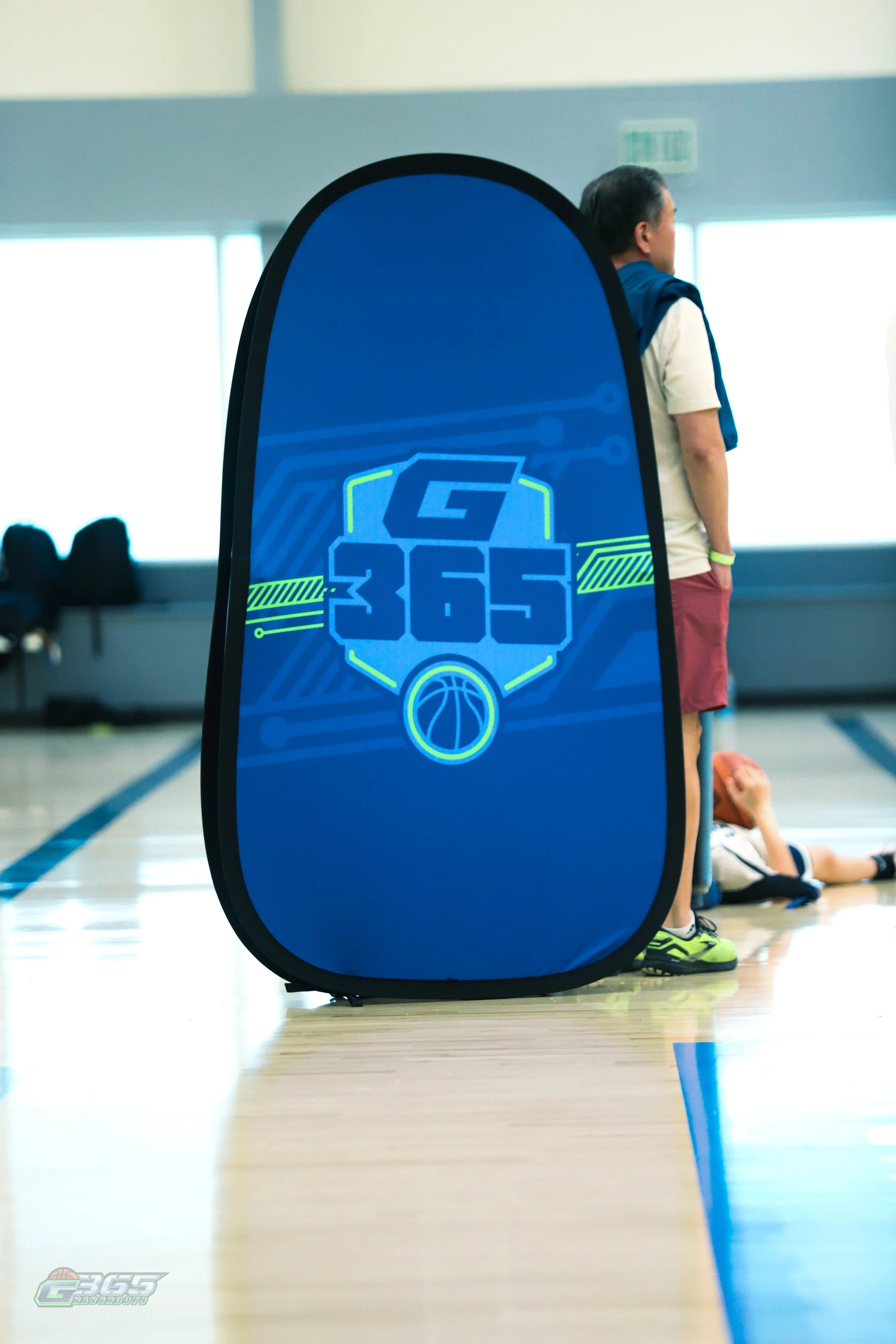
Floor Signage
The first look when an athlete walks into a 9 basketball court facility, really sets the tone. These banners were designed to do just that
G365 uses multiple locations across California and the rest of the nation. Sometimes they hold 9 basketball courts, others just 3. Each of these design pieces are used and seen on every court.